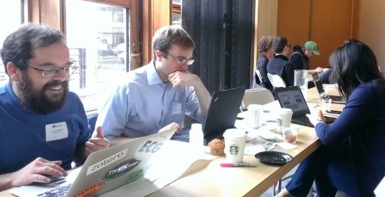
 During a lighter less-panicky moment of the CT Mirror Inequality hackathon: Jack Dougherty, Scott Gaul, Diana Deng, and other teammates
The clock had run out. At 2:30pm, our team was supposed to be heading to the downstairs auditorium to present our digital product to the panel of judges, but it wasn’t ready yet. Earlier that morning I suggested to the team that we should “freeze the code” at 2:15pm to give us time to migrate the computer application my half of the team had developed to its new host website, built by the other half of the team. But by lunchtime, several of my mistakes with data merges had slowed me down, and I blew past our self-imposed deadline, pleading for “just a few more minutes” to fix a few lines of code that had been promised, yet not delivered. When I finally stopped around 2:25pm, the broader consequences of my actions dawned on me, as my teammates’ attempts to migrate the files to their new website were blocked by our uncooperative guest network access. What a mess, and it was mostly my fault. Half of our final product was on one server, and the other half was on another, with no way to link them together.
Right at the deadline, teammate Evan came up with a simple but clever solution. As our team headed to the auditorium, he told our presenters to open a web browser and upload the two halves of our final product into two different tabs. Although the code was running on two different servers, with no functional links between them, we could create the appearance of an integrated website by seamlessly gliding from one tab to the other during the presentation. It worked. Neither the judges nor the audience seemed to notice this last-second band-aid that held together our final presentation. Our non-profit organization won the $1,000 hackathon prize. And all of these last-minute crises, agony over my mistakes, self-doubt of being judged by others, and collaboration with teammates reminded me what it feels like to be a student again.
During a lighter less-panicky moment of the CT Mirror Inequality hackathon: Jack Dougherty, Scott Gaul, Diana Deng, and other teammates
My regular job as a professor of educational studies at Trinity College offers me the opportunity to think about learning in different ways. This spring I experimented with teaching a brand-new type of half-credit course on a topic that greatly interests me, but one in which I lack any formal training or claim to expertise. Our Data Visualization internship seminar met every Monday at lunchtime, where eight students and regular guests and I worked our way through designing and building interactive online charts and maps with Hartford-area non-profit partner organizations in fields such as education, public health, journalism, and the environment. Our goal: to move beyond static charts in “flat” MS Word or PDF documents, and to transform spreadsheet data into dynamic visualizations with added value on the web. Using freely accessible Google Spreadsheets, Fusion Tables, and GitHub templates, we made interactive scatter charts that invite users to float their cursors to view underlying data points, and search-and-filter maps that allow visitors to zoom from the statewide level to their local neighborhoods. It’s a cool concept, but one that comes with a price. From January through May, I barely stayed ahead of my students and literally wrote chapters for our open-access online textbook a few hours before (or sometimes after) our weekly sessions. Teaching a new field is a great way to learn (as long as your students put up with you) and since no one else on the Trinity faculty appears to offer this type of course, I gave it a whirl. Don’t try this at home if you value sanity and peace of mind.
To push myself further out of my professorial comfort zone, at the end of the semester I volunteered to participate in a civic hackathon on inequality, sponsored by the Connecticut Mirror. Tenured faculty at well-funded colleges and universities typically enjoy significant autonomy over how we define our scholarly goals and spend our work time, often on solitary projects. Before the hackathon, I joked with my students that the experience would put me in their shoes. Each team would be granted six hours to create a digital solution to an inequality problem and to present our work to a panel of judges.
Two weeks before the hackathon, CT Mirror and the reSET Social Enterprise Group hosted a meet-up to create teams, where I joined up with Erin Boggs, director of the Open Communities Alliance, a new non-profit organization based in Hartford. Erin works with housing counselors who advise clients with publicly-funded rental subsidies on where to look for apartments. Connecticut minority residents with section 8 housing vouchers are disproportionately likely to reside in racially-isolated, high-poverty areas, according to a 2009 Kirwan Institute report. But Erin points to studies of Baltimore that have shown that when housing counselors provide information and support, urban residents have successfully moved with rental subsidies into higher-opportunity neighborhoods. Furthermore, Erin drew my attention to housing mobility map designed for Dallas, Texas, and challenged our team to create a better version for Connecticut. (Learn more about Housing Mobility programs and research across the nation.) Given my interests in education, housing, and data visualization, I was hooked.
[iframe src=”https://docs.google.com/presentation/d/11PvQETJ0Lx53cUb2xz96KK0EsGNkTkMGOkxKR64f3cg/embed?start=false&loop=false&delayms=3000″ frameborder=”0″ width=”600″ height=”479″ allowfullscreen=”true” mozallowfullscreen=”true” webkitallowfullscreen=”true”]
Housing Mobility Tool Presentation at CT Mirror Hackathon 2014 by Erin Boggs
| This was the first time that I had ever participated — or even attended — a hackathon. Prior to this, the closest experience I’ve had was One Week | One Tool</a> at the Center for History and New Media in summer 2013, where a dozen digital humanists came together to design and build a digital tool for exploring online archives. While I’m comfortable working with coders, I always clarify that I’m not really one of them, due to the lack of training and skill sets. At One Week | One Tool, I was assigned to the outreach & marketing team, where I allegedly channeled channeled Don Draper or Peggy Olson (depends on who you ask) in dreaming up the vision and language for our digital humanities tool, while the real coders worked in the design & development team in the other room. But at the CT Mirror hackathon, my role had shifted. When the seven of us sat down to figure out the tasks and the division of labor, it became clear that my task was to lead the code design for the housing mobility map tool. |
How could someone like me who lacks formal programming skills step into the role of lead coder? The answer: templates. During the Data Visualization seminar, my students and I began using some fabulous code templates designed by Derek Eder for building search-and-filter maps, which he originally created for open-data projects and non-profit organizations in Chicago. While teaching the seminar I’ve learned how to copy, clone, and tweak Derek’s code repositories on the GitHub open-source platform, which makes it easy to see and share with others. Although I lack the skills to write lines of HTML and JavaScript from scratch, reading and testing lots of open-source examples has given me a richer understanding of how the code actually works, especially when I try to change something and accidentally break it, then have to make it work again. By studying the logic of Derek’s templates and learning by trial and error, I’ve been able to modify and customize certain features and explain it more clearly to my students, often by inserting additional “code comments” for non-programmers.
 Excerpt of Derek Eder’s code, supplemented with my comments to clarify steps for newcomers</figcaption></figure>
Sometimes my attempts to tweak code ended in failure. While teaching the Data Visualization seminar this spring, I tried several times to modify Derek’s Vacant and Abandoned Buildings map tool into a more generic format that my students and I could use for our non-profit organizations. Turns out that task was beyond my limited skills. So I reached out to Derek and offered him $100 from my project budget to help me create a working template for a 2-layer search-and-filter map. It allows users to search a map and also turn on/off color-coded points (e.g. locations of schools, grocery stores, etc.) or color-shaded polygons (municipal or census boundaries with data values). Derek kindly taught me what I was doing wrong, made some fixes, and now his template (with my additional code comments and small modifications) is openly available online for anyone to use. In fact, this template provided the foundation for our Housing Mobility Map that won the $1,000 hackathon prize. We couldn’t have done it without the open-source code community.
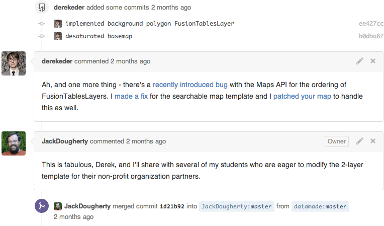 My correspondence with Derek Eder about template code fixes on GitHub.
So what exactly does our Housing Mobility Map do? At present, it’s a simple beta-version prototype. When housing mobility counselors meet with clients to discuss where they wish to live with their portable rental subsidy vouchers, they can enter an apartment or house listing to see the area’s opportunity level (darker shading is higher, based on data from the 2009 Kirwan report), as well as the location of schools, child care centers, and grocery stores. Also, it’s a mobile tool that works well on smartphones and most portable devices, with a responsive theme that automatically adjusts to the screen size.
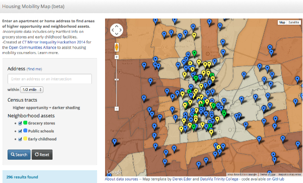 Housing Mobility Map screenshot (beta version).
Working with a smart and diversely talented team sparks a very powerful feeling inside me, since these digital projects become so complex that no one person knows how to make all of the pieces fit together. Even the part of my job that I thought I knew well (merging data spreadsheets with census tract geography in Google Fusion Tables, which I’ve taught all semester to my students) turned into a hour-long disaster when I couldn’t make tracts with decimals behave properly. Census tract 100 merged nicely, but not tract 101.01. Teammate Scott Gaul from the Community Indicators Project of the Hartford Foundation for Public Giving calmly walked me through the trouble-shooting phase to find a solution. (Hint: transform the census tract column from numerical to textual data before merging. Reminder to self: add that to my online textbook.) Scott and Diana Deng, our teammate from the Partnership for Strong Communities, also grappled with downloading and cleaning data from the Connecticut Department of Health licensing database for child care facilities. On the other side of the room, Evan Dobos and Elliot Berg from Picture This Web Center built a brand-new website for the Open Communities Alliance to host all of this content, and more about the organization. Team leaders Erin Boggs and Chris Brechelin, from Blue Print for a Dream, worked with everyone to help glue together all of the pieces, deliver the presentation to the judges, and face their tough questions during the Q&A round.
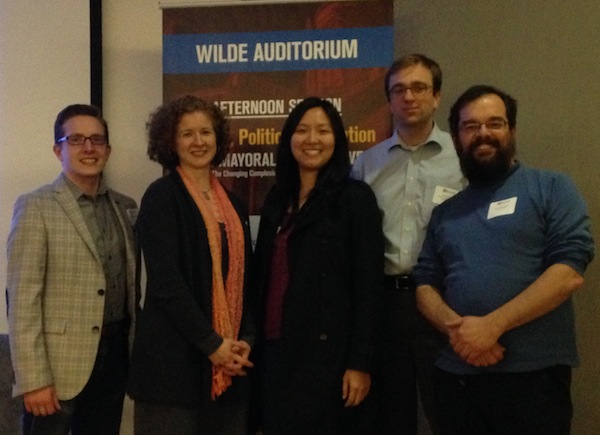 Chris Brechlin, Erin Boggs, Diana Deng, Scott Gaul, and Jack Dougherty. Photo from WSHU public radio, StateOfDisparity.org
We simply didn’t have enough time or data access to do everything we wanted in this six-hour sprint (which, by the time we got our act together and straightened out our personal tech and wireless access issues, turned into only four hours). The 2009 Opportunity report relied on 2000 Census tract data and geography, which needs to be updated. We still need statewide listings of public schools, early childhood care, and grocery stores, since our prototype displays only Hartford city or regional data. Furthermore, while we found online data sources for public transportation, our team did not reach a decision on the best way to display this information. (Personally, I rooted for displaying Google Directions point A-to-B routing service as a layer on top of our map, but am not sure if I have the coding skills to make it work smoothly.) Lots of work remains to be done, and the $1,000 prize was awarded to advance the project. If you wish to contribute your ideas or services, comment on our public design notes or email Erin Boggs at the Open Communities Alliance.
Participating in my first hackathon made me feel like a student again, with all of the positive and negative emotions that come from collaborating with a team, working toward a common goal, and dealing with the consequences of your mistakes in a public competition. It’s good to feel young again. But the professorial side of me needs to pose a deeper question that we sometimes avoid in these settings. Can a digital tool actually “solve” inequalities? Beware the hype that surrounds the hackathon. While I fully support hands-on educational learning events like these, let’s not forget that the web is primarily good for one thing — collecting and sharing information — which does not necessarily resolve the root causes of housing inequality in Connecticut. Our fundamental problem is not simply that low-income families cannot find affordable housing; more broadly, our state allows municipal zoning policies that limit the availability of affordable housing in many communities, as we demonstrated in the online Connecticut Zoning Initiative. Let’s work on both the demand and supply sides of this issue. Keep on hacking the code — and the public policies.